|
Croker-Rhyne Co., Inc. |
|
Main Page |
Philosophy | Current
Recommendations |
Newsletter Archives Contact Us
|
|
|
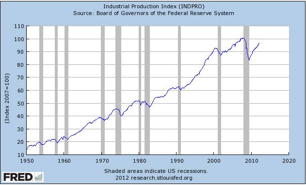
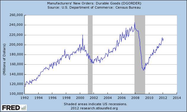
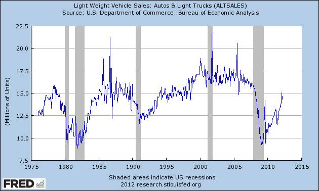
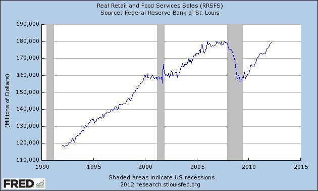
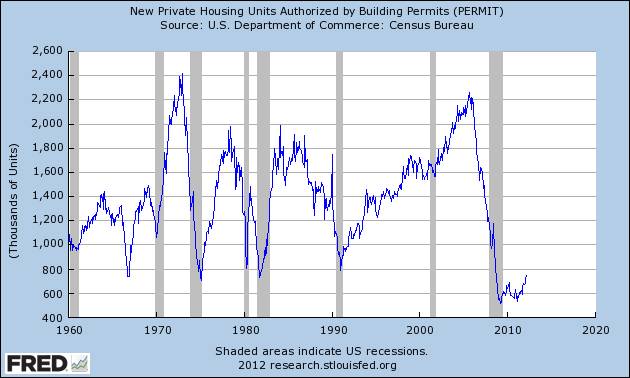
April 17, 2012 Still believe stocks are a roaring buy... Seems like forever there have been countless “expert” predictions that the economy was on slippery ground and ready to turn sharply lower any day now. My own opinion has been, and still is, we are on the cusp of a gigantic, worldwide boom…Along those same lines, I have been, and still am, EXTREMELY bullish on the stock market while the preponderance of opinion has been looking, again, FOREVER, for a downturn in equities…ANY down day in stocks seems to generate a flood of predictions that “the correction has begun”, or “bear market ahead”, or more generally, “Don’t buy stocks here”. Get a week or two on the down side, as was recently the case, and “analysts” get so angst ridden you’d think the DOW has just dropped 4000 points or something. FOR MY MONEY, I REMAIN EXTREMELY BULLISH THE ECONOMY AND STOCKS…AND I AM STILL VERY MUCH A BUYER. But you can decide for yourself…All of the charts of economic indicators you could ever want to see are free and easily accessible at one of the Fed’s websites, http://research.stlouisfed.org/fred2/ , but here are some quick ones I just copied and pasted from their site. I think these charts speak for themselves, and as you flip through them, without getting too complicated, I’d just say you only need to ask yourself what direction they ALL seem to be (and have been) pointing as regards the economy…and then ask yourself, as I do, “What in the hell is the economic community seeing that says we are on weak legs?” FYI, the grey areas on all the charts are periods in which we were in recession…Also, if you are not that specifically sure about what goes into calculating these charts, the titles of each should at least give you a decent idea as to what is being measured. And again, do not make the mistake of having your conclusions based on all the negative leaning junk supposed experts have been preaching…Just “read” the chart…Let it tell you…
With all the talk about “we’re not creating jobs fast enough”, doesn't the Unemployment Rate still looks like it’s moving somewhat identically to how it did coming out of the previous six recessions?
As we all know, Housing and Construction have been the weak areas of the economy…so these charts do not show the same strength…BUT, they do appear to have stabilized and/or turned up?
As I keep repeating, how fast all these indicators are moving is not the important thing…It’s simply that they are heading in the right direction… Here is the big picture…
Here is how I'd do the trade...
Give me a call if you’re interested…And I’d add that virtually everyone I talk to is doubtful about this idea… Thanks, Bill P.S. I immediately have another newsletter in the works. What I think is a truly enormous trade… 866-578-1001 770-425-7241 |
|